
Good website design: what it is, real examples, and how to tell if yours works
Oct 9, 2026 9 min read
Good website design: what it is, real examples, and how to tell if yours works
By Scott Garrison

In this article
TL;DR
Good website design is design that gets the right visitor to understand you, trust you and take the next step, quickly. Looking beautiful helps, but it's not the test. The test is whether people stay, believe you and get in touch.
Most "good website design" lists are galleries of pretty sites. They're great for inspiration, but they rarely tell you why a design works or whether it brings in business. Awwwards, the best-known design award, scores sites on design, usability, creativity and content, with no criterion for conversion at all.1 This guide covers what research says good website design actually is, real examples and what they do well, and a quick way to grade your own site.
What makes a good website design?
Here's what the research says, in plain terms.
First impressions happen almost instantly
In a well-known 2006 study, people rated websites' visual appeal after seeing them for 50 milliseconds, and those ratings closely matched how they rated the sites after looking longer. That first impression then carried over to how usable and credible they found the site.2
A later Google study went further. Visual complexity affected people's judgments even at 17 milliseconds, and the sites rated most appealing were simple and looked like a typical site of their kind.3 The lesson for a business: be distinctive in your brand, but familiar in your structure. Put the navigation where people expect it.
Visitors decide in about 10 seconds whether to stay
Nielsen Norman Group's analysis of more than 205,000 pages found the first 10 seconds of a visit are critical. Pages that pass that test can hold people for two minutes or more.7 Your value proposition needs to land in those 10 seconds.
Good design guides the eye
Visual hierarchy means arranging a page so people notice things in order of importance, using size, color, contrast and spacing.8 On a well-designed page, one thing clearly stands out on each screen.
People also scan rather than read. On pages with long, unformatted text, readers skim in an F-shaped pattern and miss what sits further down or to the right.9 Front-load headings with the important words, keep paragraphs short, use lists and bold the key terms.9
Pretty helps, up to a point
The aesthetic-usability effect is real: people perceive attractive designs as easier to use, and forgive minor problems because of it. But good looks can't rescue serious usability problems,4 and anything that looks like an ad, such as animated banners or flashy promo bars, tends to get ignored.10
Trust is designed, not claimed
According to Nielsen Norman Group, four things make a site feel credible: polish (no typos or broken links), being upfront about details like pricing and contact information, content that's complete and current, and links to the wider web, such as independent reviews.11 For a service business, that means showing real work, real clients and real reviews, not just saying you're the best.
Good website design includes speed and accessibility
Galleries judge sites by how they look. Visitors also judge how they work.
Speed. Google calls a page good when its main content loads within 2.5 seconds, it responds to taps within 200 milliseconds, and it doesn't jump around while loading.12 Only 48% of mobile sites and 56% of desktop sites pass all three.5 It matters for business: Portent found B2B lead-generation sites that load in 1 second convert about three times better than those that take 5 seconds,13 and a study for Google found a 0.1-second mobile speedup went with 21.6% more visitors reaching the lead form on lead-gen sites.14 Images are often the culprit; they're the biggest element on about 76% of mobile pages.5
Mobile. In the US, traffic is now split almost evenly: 49.1% mobile and 48.5% desktop.15 Your site has to work well on both, including the inquiry form.
Accessibility. WebAIM's 2026 analysis of the top million home pages found 95.9% had detectable accessibility failures, averaging 56.1 errors per page.6 The most common:
| Problem | Share of home pages |
|---|---|
| Low-contrast text | 83.9%6 |
| Missing image alt text | 53.1%6 |
| Missing form labels | 51%6 |
| Empty links | 46.3%6 |
Low-contrast text is a design decision. Fixing it makes a site easier for everyone to read.
Good website design examples
Here are well-regarded business websites and what each does well. A caution first: award pages and agency case studies rarely publish business results, so treat these as examples of craft, and judge your own site by what it brings in.
- Arup (engineering consultancy). A 2026 Webby Honoree for professional services. The site was built to reflect new positioning, generate leads and recruit engineers, with short summaries up front and deeper technical detail for those who want it.16 The agency behind it reports 50% more clicks from market pages to service pages.16
- ComPsych (workplace mental health). A 2026 Webby winner for corporate communications, built alongside a full rebrand.1718
- Gelato La Boca (Dallas gelato shop). A 2025 Webby winner for food and drink. The brief was to introduce a new brand and drive delivery orders on desktop and mobile; it uses 3D and motion without hurting performance.19
- Jesko Jets (private jet charter). An Awwwards Site of the Day in 2026, praised for its animation. Its lowest jury scores were for accessibility (6.4 out of 10) and SEO (6.8),1 a good reminder that showpiece sites aren't always the best business sites.
- Linear (software). Its interface and animations load instantly, showing the product's speed instead of claiming it.20
- Pentagram (design firm). A minimal portfolio on a spacious grid, where the work itself is the proof.20
- Airbnb. Prominent search, intuitive filters and high-quality photography.20
- Mailchimp. A consistent design system, custom illustration and a distinctive yellow palette.20
What the business sites have in common: they say what they do immediately, show proof, and make the next step obvious. That's the standard for a service business too.
Self-audit
Is your website design actually good?
Open your homepage on your phone and tick what's true today.
Can ChatGPT or AI design a good website?
AI can draft a website quickly. Nielsen Norman Group tested tools including v0, Bolt, Lovable, Figma Make, ChatGPT and Claude, and found they produce high-fidelity prototypes fast, which is useful for exploring ideas.21 But the output tends to look generic, misses details like color contrast and spacing, and falls back on common patterns instead of making deliberate design choices.21 Their 2025 review found most generative tools still can't balance all of a design's requirements.22
AI can make a page that looks like a website. It doesn't know your positioning, your proof or what makes your buyer trust you, and that's what turns a nice-looking site into one that brings in clients.
How to tell if your website design is good
Run through this on your phone:
- The 10-second test. Could a stranger say what you do, who it's for and what to do next?7
- Simple and familiar. Is the navigation where people expect, with little clutter?3
- One focal point per screen. Does one thing clearly stand out?8
- Scannable. Short paragraphs, clear headings, lists?9
- Proof up front. Real work, testimonials, client logos and reviews?11
- Speed. Does it pass Google's PageSpeed Insights on mobile?12
- Forms. Do you ask only for what you need? Baymard's research on checkouts found the average US form asks for nearly twice as many fields as needed.23
- Accessibility. Run a free checker like WAVE and fix contrast, alt text and form labels.6
- Watch a real person use it. Don't ask whether they like it. Watch whether they can do the main thing.4
How we design websites at Goat Sites
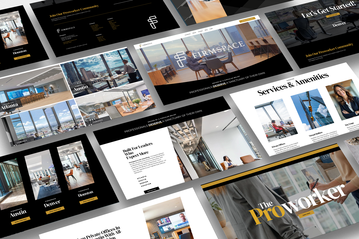
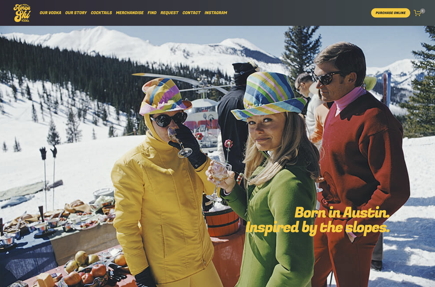
We build authority-driven websites for founder-led companies, so we design for the standard in this guide: understood in seconds, trusted on sight, and built to turn visitors into conversations. That's the approach behind sites like Firmspace, Après Ski Vodka and Intention.
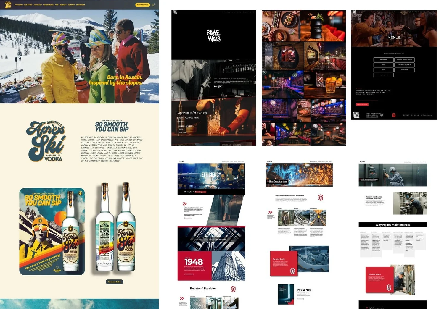
If you want an outside view of your current site, start with our no-cost Authority Scorecard. You can also see more of our work in our case studies, or read about our Authority Install.
Get a straight answer
Get a website recommendation for your business
Tell us about your business and your current site. You'll get a short, honest take on what to fix first and what a rebuild would involve.
Good website design: FAQs
What makes a good website design?
What is the best design for a website?
For a business, one that's distinctive in its brand but familiar in its structure. Google research found simple, typical-looking sites win first impressions.3
How much does it cost to design a good website?
It depends on who builds it and how much strategy and copy are included. See our full guide to website costs for real 2026 price ranges.
Can ChatGPT design a website?
How fast should my website load?
Does good design affect trust?
Is an award-winning website a good business website?
Not necessarily. Awwwards scores design, usability, creativity and content, but not conversion, and some winners score low on accessibility and SEO.1
Sources
- Awwwards, Jesko Jets: Site of the Day (2026)
- Nature News, Web users judge sites in the blink of an eye (Lindgaard et al.) (2006)
- Google Research, Users love simple and familiar designs (2012)
- Nielsen Norman Group, The Aesthetic-Usability Effect (2024)
- HTTP Archive, Web Almanac 2025: Performance (2026)
- WebAIM, The WebAIM Million 2026 (2026)
- Nielsen Norman Group, How Long Do Users Stay on Web Pages? (2011)
- Nielsen Norman Group, Visual Hierarchy in UX: Definition (2021)
- Nielsen Norman Group, F-Shaped Pattern of Reading on the Web (2017)
- Nielsen Norman Group, Banner Blindness Revisited (2018)
- Nielsen Norman Group, Trustworthiness in Web Design: 4 Credibility Factors (2016)
- web.dev (Google), Web Vitals (2024)
- Portent, Site Speed is (Still) Impacting Your Conversion Rate (2022)
- web.dev (Google), Milliseconds Make Millions (Deloitte Digital) (2020)
- StatCounter, Desktop vs Mobile vs Tablet market share, United States (2026)
- UNRVLD, UNRVLD's work recognised at the 30th Annual Webby Awards (2026)
- The Webby Awards, Webby winners: Corporate Communications (2026)
- DesignRush News, ComPsych logo redesign by Konpo (2026)
- The Webby Awards, Gelato La Boca (Crafted with Code) (2025)
- UXPin, 15 Best Website Design Examples (2026) (2026)
- Nielsen Norman Group, AI Prototyping in Real Design Contexts (2025)
- Nielsen Norman Group, AI Design Tools Are Marginally Better: Status Update (2025)
- Baymard Institute, Cart abandonment rate statistics (2025)
Authority Scorecard
See how your website stacks up
A no-cost assessment of where your website builds trust and where it loses leads, before you hire anyone.
Get my Authority Score